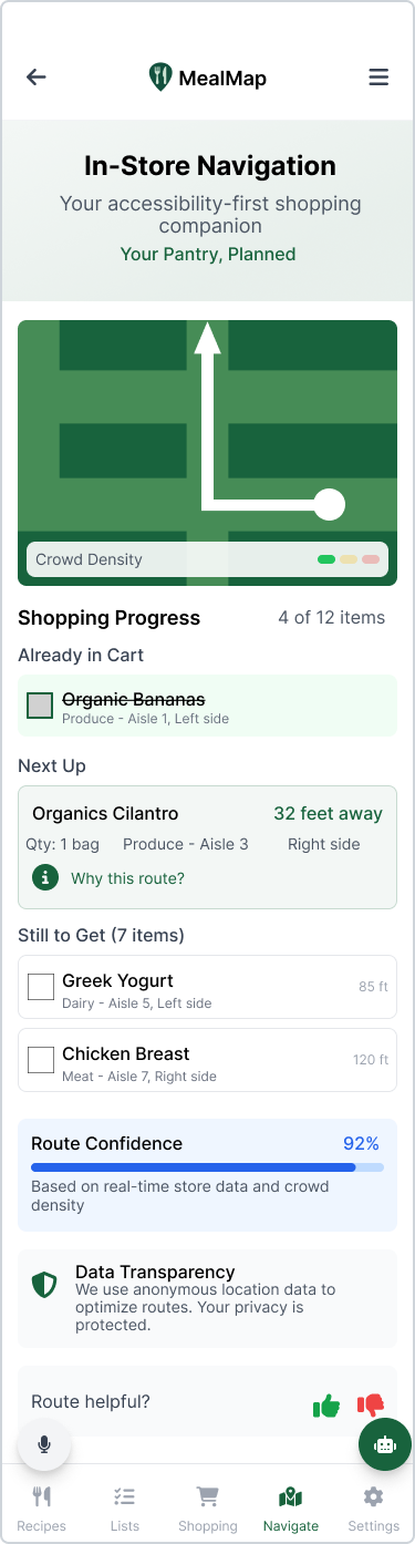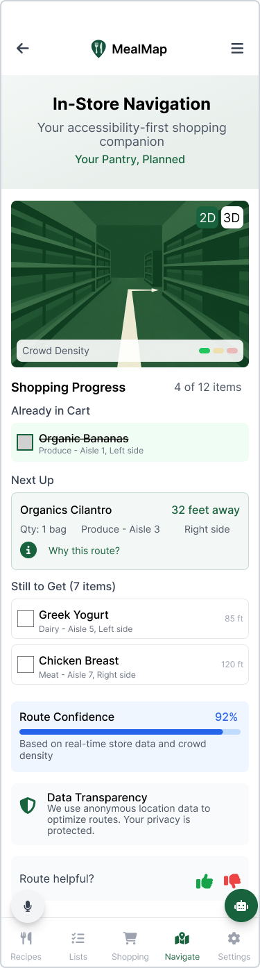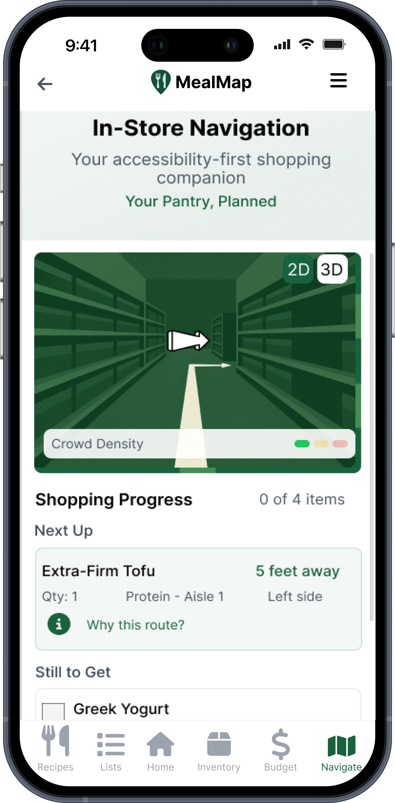
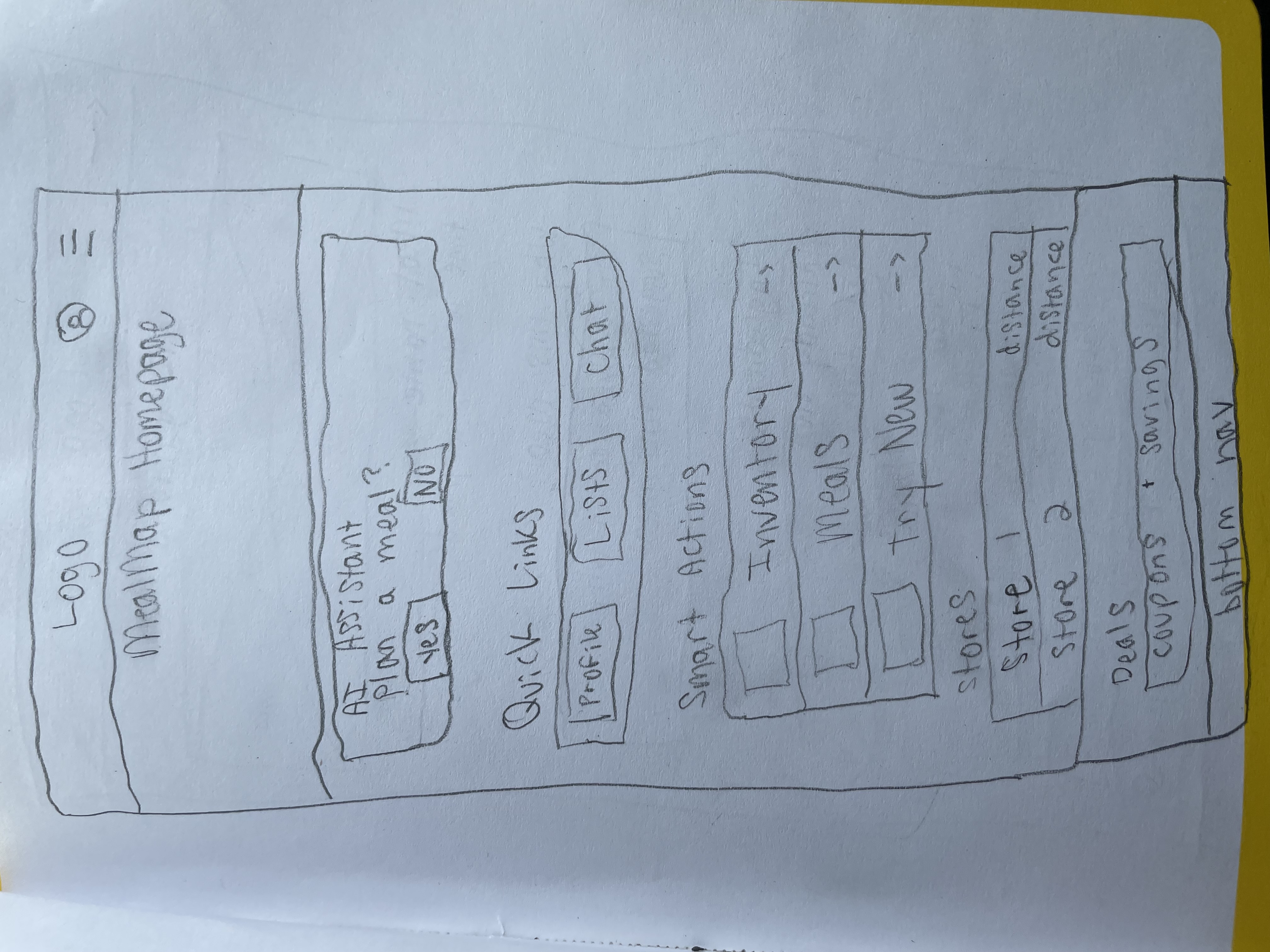
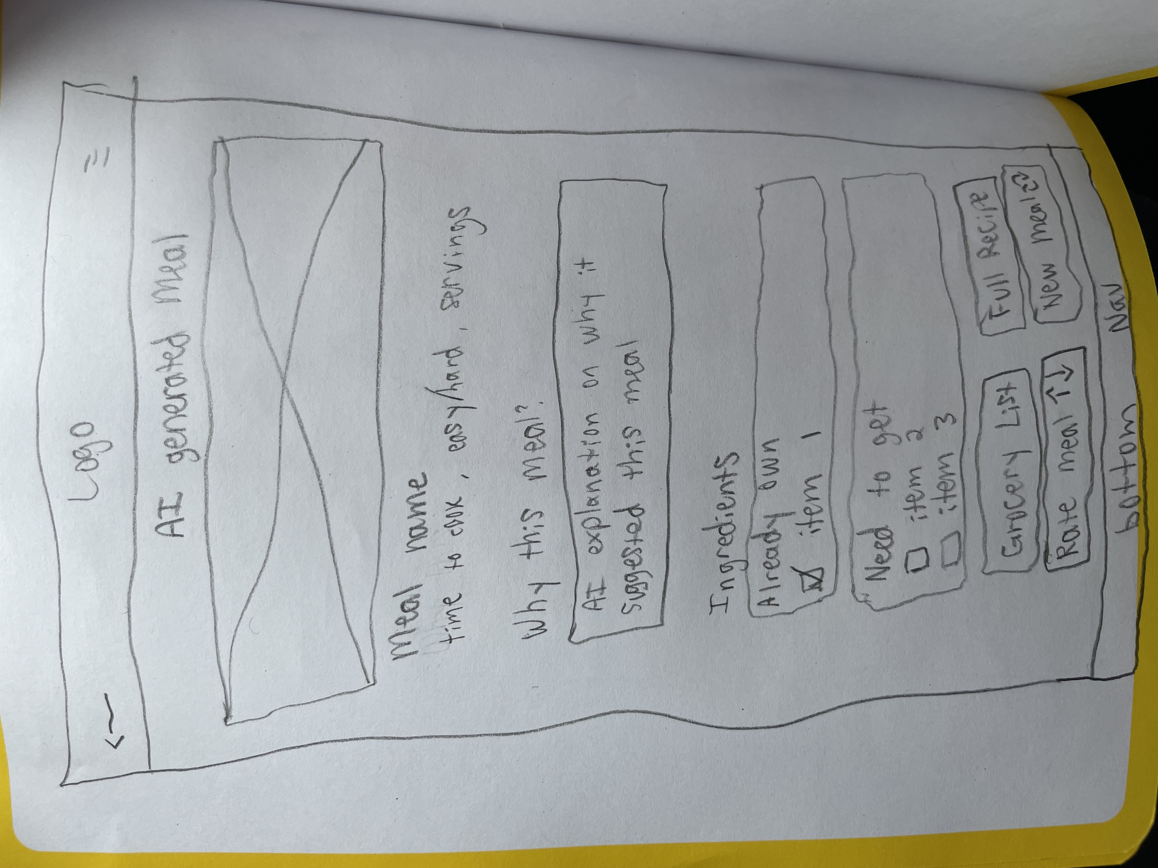
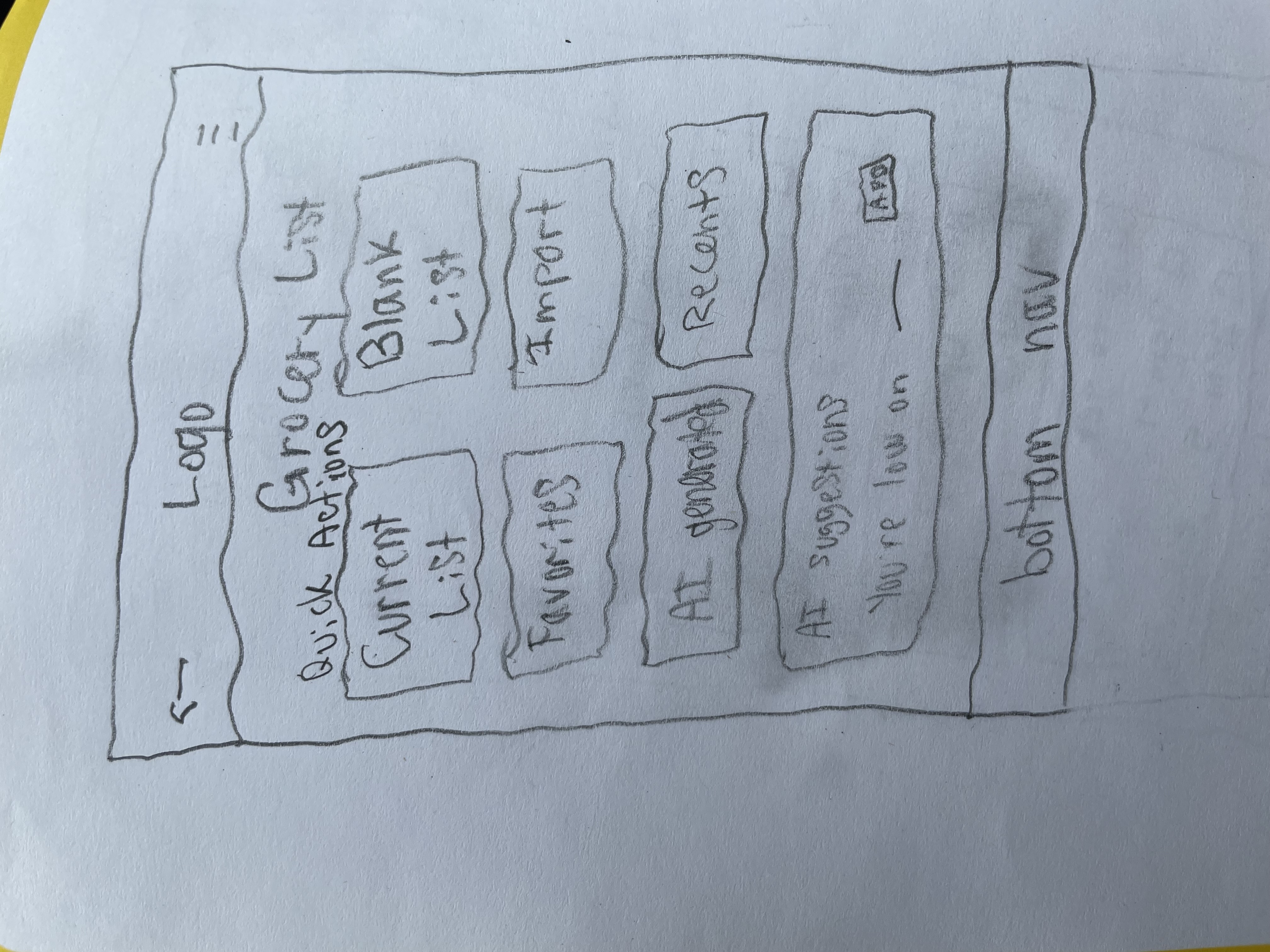
01
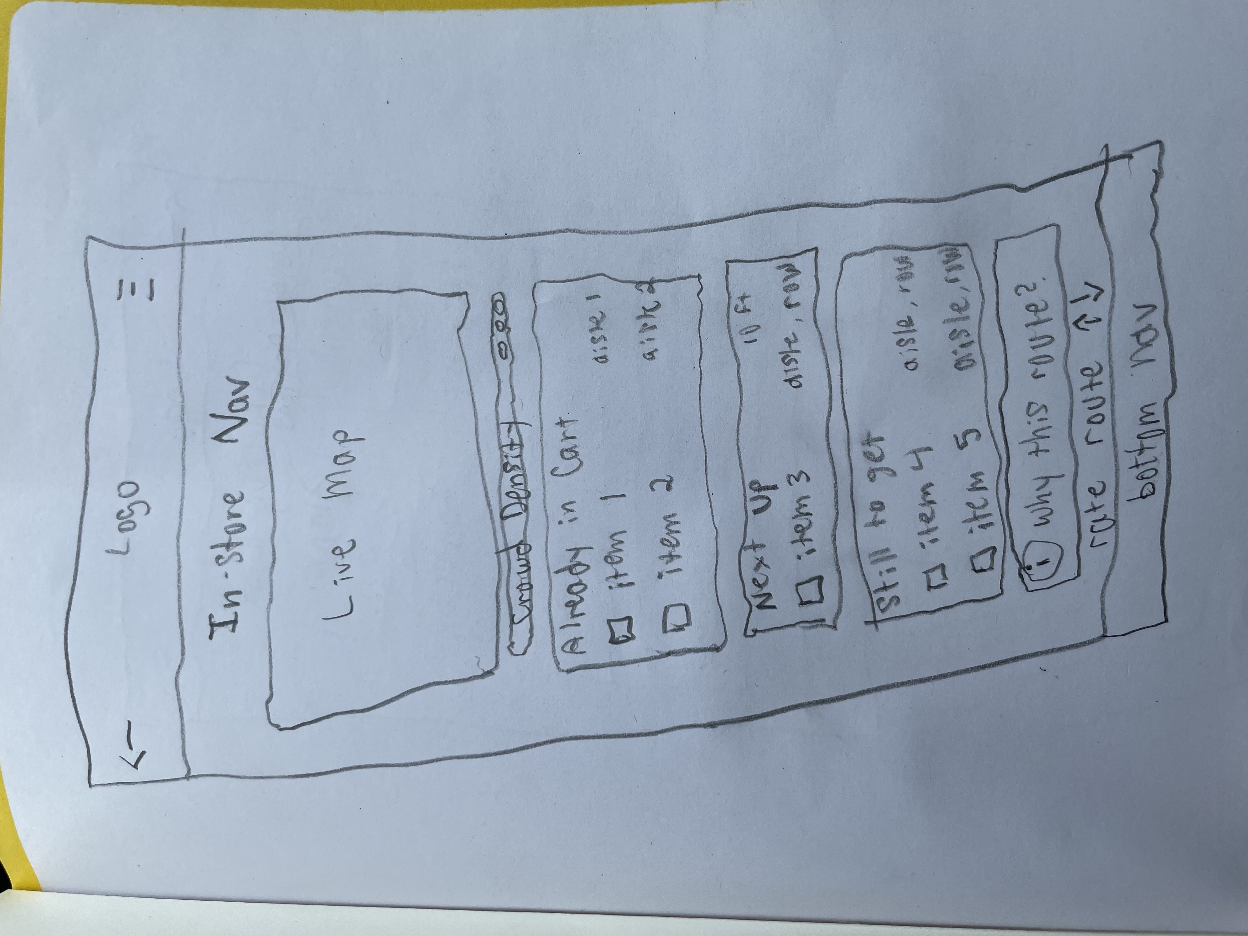
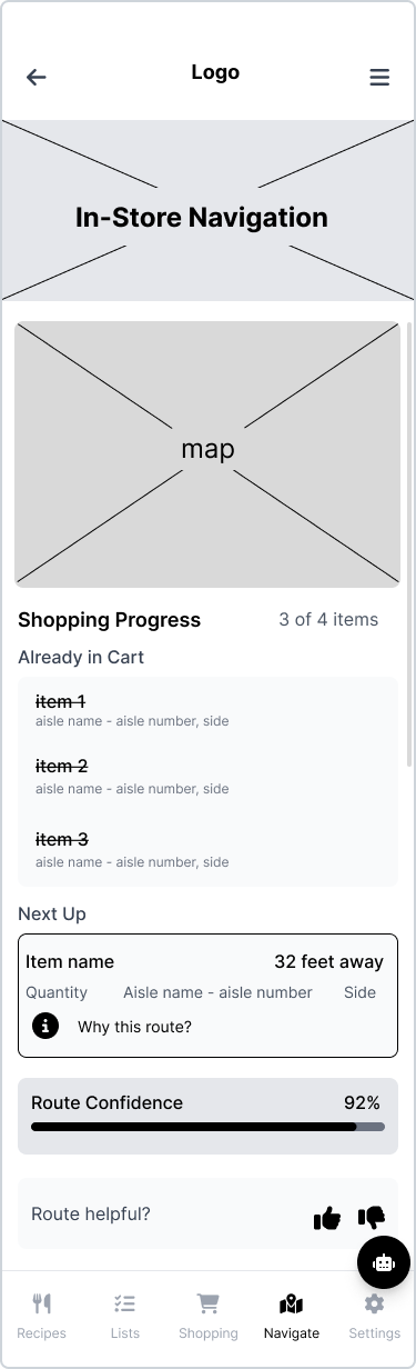
Confirming items in cart
From auto-confirmation to digital scratch-off
Before

Problem identified
Users were confused by the auto-confirmation that they had added an item to their basket once they tapped on the live map for new directions.
After
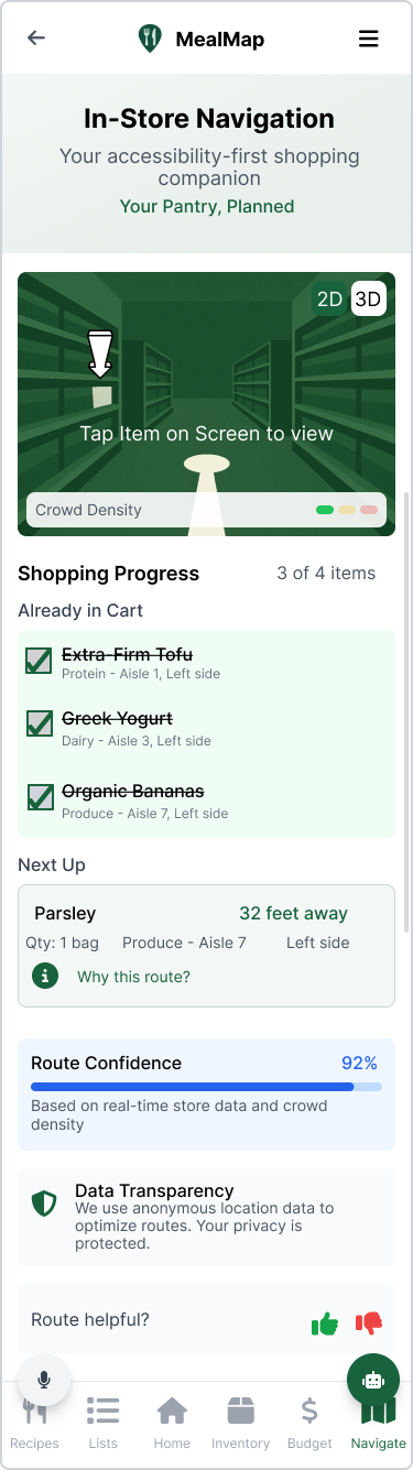
Design decision
By adding a simple checkbox, users were able to regain a sense of control and internal confirmation: "I got my item." It mirrored the familiar action of scratching an item off a handwritten list.
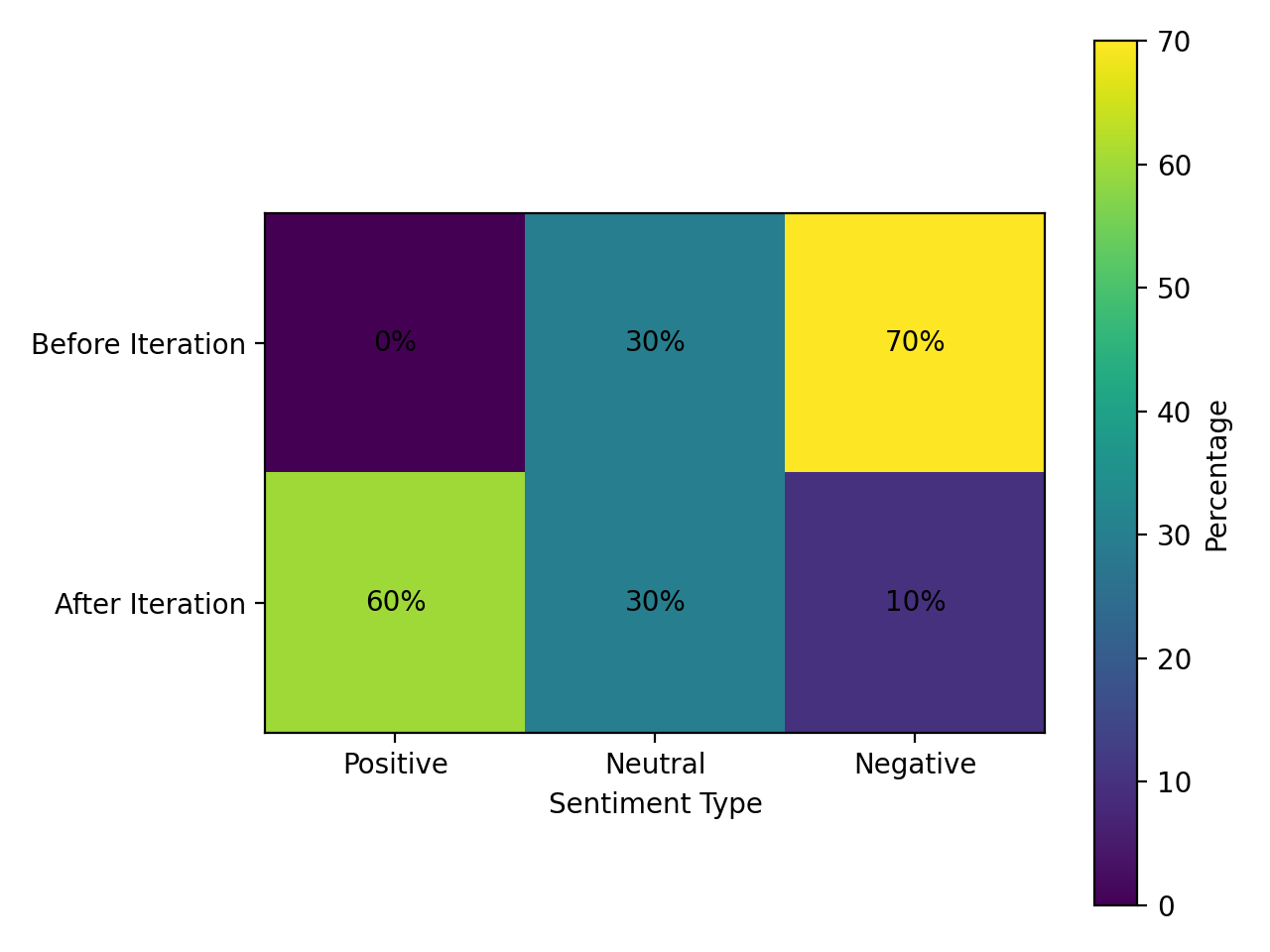
Result
Users gained confidence in their purchasing ability.